AO Communications
Communication strategy for today's digital landscape.
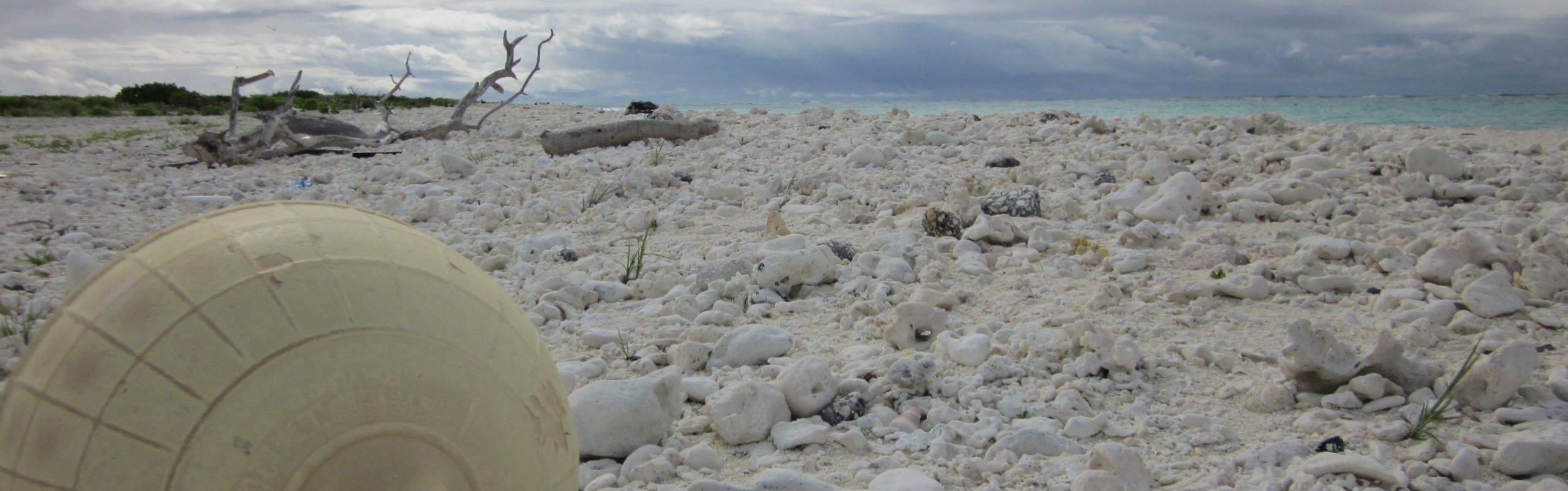
Final logo- Plastic Free Hawaii
![]()
Plastic Free Hawaii 808 has been updated quite a bit. One of the suggestions was to reverse the color gradient of each circle so that the islands were sitting on blue instead of yellow. I thought that would actually be great to make the logo pop a bit and be more effective in it’s messaging. I used the orange to red gradient to signify the islands over lava, show that the islands are in danger but could also be the dawn of a new day. Per a suggestion I added some texture to the island chain by adding a .25 stroke in white around each separately. I decided to leave the blue stroke around the logo in place as I like the paintbrush definition. Also it symbolizes a wave breaking over the sun. My goal with this image is to create balance between the light and darker elements through shading and color. Tone is conveyed through the sun gradient. Also when creating this logo, I was thinking about how it would print as a sticker, a patch and be used as a website logo. This logo is meant to convey a sense of urgency about plastic in Hawaii but through a tropical, island lens. Some had asked what the significance of the 808 is at the bottom of image. For local Hawaii people the 808 is seen quite a bit in the public; on shirts, auto decals and it represents island pride. The state area code, all islands are represented as well unifying the island chain as a whole. So Hawaiians from the Big Island are connected to their brothers on Ni’ihau. Further to continue the theme of unification, all of the islands are placed in close proximity of each other. Some of that was necessary for space consideration but it is an artistic rendering of the arc of the island chain. 808 Hawaiian Pride!
